Category Archives: Discussion

Statistics anxiety: Busting the anxious women myth?

Dr Vicky Gorton, Dr Kevin Ralston, June 2020

For many students Statistics = Anxiety. This anxiety is often characterised as limiting students’ engagement with statistics and impacting on their performance on quantitative methods courses at university. The relationships between age, gender and statistics anxiety are some of the most examined in the research literature. A survey of these findings might lead us to reformulate the Statistics = Anxiety equation to read: Statistics + Women = >Anxiety, as previous research has tended to identify women as more likely to experience anxiety and at greater levels.

In our article, ‘Anxious women or complacent men? Examining statistics anxiety in UK sociology undergraduates’, we wanted to revisit the core demographic variables of age and sex to examine their association with reported anxiety of statistics. Unlike most other research in the field however, we modelled an interaction between these two variables. This allowed us to explore whether reported anxiety of statistics varies within and between sexes by levels of age (comparing under 25s with those 25 and over).

The research is based on a secondary analysis of a dataset on the attitudes of sociology and political science students towards quantitative methods. These data, gathered by Williams et al. (2009) and shared on the UK data archive, are amongst the most comprehensive ever collected on attitudes of undergraduates to QM. Crucially, for our aims, the students were asked whether they felt anxious about learning statistics. This made it possible to interrogate these data to explore in detail the relationship between age, gender and anxiety of statistics.

The methods we used for the analysis are the same general techniques that many social science undergraduates will learn about during their own quantitative methods courses – logistic regression models and bivariate analysis. Our paper provides a simple applied account of these methods, which would be a relevant example in learning-teaching settings.

The results indicate that it is older men, not women, who are most likely to report experiencing anxiety of statistics in social science contexts. This is only apparent when considering the interaction between age and gender, without this interaction there is no difference between men and women in the likelihood of experiencing statistics anxiety.

It is therefore possible that young men, who are less anxious, have driven the gender differences that have previously been reported in research. This is to say that, rather than experiencing excessive anxiety, women may seem more anxious in previous studies because of their comparison to a group of more complacent young men.

The results call into question the potentially damaging ‘anxious women’ narrative that predominates the literature on the teaching-learning of maths and statistics. We suggest that this paradigm may be misleading, distracting, and an oversimplification. Despite the research focus on statistics anxiety, there is no strong evidence that it has a meaningfully negative influence on the learning of statistics for those on social science courses. By comparison, the pedagogical implications of an issue like complacency in this context has received little consideration. Overall, we argue that it is time to move away from the perception that women studying social sciences are excessively anxious of statistics. Our findings suggest that this is a myth in need of busting.

Photo by Priscilla Du Preez on Unsplash


Data driven: the employment rate of 16 to 24 year olds

Kevin Ralston 2019, York St John University

This series of posts will apply nationally collected, representative data to highlight some of the trends underlying the official employment rate.

This current post employs data from the Labour Force Survey, Labour Market Statistics to chart the youth employment rate. The data are freely available from the Office for National Statistics (ONS) and the UK data service.

Figure 1 (available here)
Youth_unemployment

The UK Government has been celebrating what is described as a record high employment rate. The most recent employment rate estimate is at 75.8%. It seems to be unalloyed good news. Yet a high employment rate is only part of the story. The high top-line level of employment has been underscored by stagnating wages and increasing levels of extreme poverty. People have paid work, but many are still getting poorer.

Figure 1 illustrates that this high level of employment is not experienced equally by all groups. The youth employment rate is only 54%. The male youth employment rate is around ten percent lower than it was in 2001. The female youth employment rate is around seven percent lower than it was 2001.

The youth labour market was collapsing from 2001-2002. The Figure also indicates just how catastrophic the Great Recession of 2008 was for young people’s employment prospects.

The chances of young men and women making an early transition into the labour force has declined substantially in the last twenty years. This is worth bearing in mind when you see it asserted that the UK employment rate is high. It is, but there are substantial problems underlying the top-line trend.

Technical note:
The data from 1993 to 2017 were published by ONS as Labour Market Statistics. This did not, at time of writing, include information for 2018. The 2018 figure was taken from the first three quarters of the 2018 Labour Force Survey. In estimating the rate the individual person weight [PWT17] was applied.
The code to generate the graph and the data are available on GitHub


Feynman on sociology

Kevin Ralston, York St John University, 2018

Richard Feynman

Richard P. Feynman (1918-1988) was a theoretical physicist who was part of the team who worked on the atomic bomb at Los Alamos. This year was the 30th anniversary of his death. He won the Nobel Prize for physics in 1965, which he shared with two others. He studied at MIT and Princeton before taking posts at Cornell and Caltech. By the time of his death he was one of the most famous scientists in the world.

From the standpoint of today Feynman seems like an exceptionally high-spirited academic who had many diverse interests. Within physics he developed pedagogical materials and programs of study. Beyond physics he was involved in selecting resources for the high school science curriculum and sat on the enquiry for the Challenger space shuttle disaster. At times he also wrote about what he considered the contribution made by non-scientific fields of study. Perhaps then, it is worth taking note of what a Nobel Laureate wrote about an encounter he had with sociology. This occurred at a conference where he was the scientific representative among academics from various disciplines who had been brought together to discuss the ethics of equality.

There was this sociologist who had written a paper for us all to read ahead of time. I started to read the damn thing, and my eyes were coming out: I couldn’t make head nor tail of it! I figured it was because I hadn’t read any of the books on the list. I had this uneasy feeling of “I’m not adequate,” until finally I said to myself “I’m gonna stop, and read one sentence slowly so I can figure out what the hell it means.”

So I stopped-at random-and read the next sentence very carefully. I can’t remember it precisely, but it was very close to this: “The individual member of the social community often receives his information via visual, symbolic channels.” I went back and forth over it, and translated. You know what it means? “People read.”

Then I went over the next sentence, and realised that I could translate that one also. Then it became a kind of empty business: “Sometimes people read; sometimes people listen to the radio,” and so on, but written in such a fancy way that I couldn’t understand it at first, and when I finally deciphered it, there was nothing to it. 

Richard P. Feynman 1989 ‘Surely you’re joking, Mr. Feynman’, Unwin: London

As a sociology undergraduate and post-grad I read a lot of theory in the original. I read Marx on Capital, the penguin classics edition in three volumes. I read Foucault and remember quoting from the text in a seminar and the lecturer commented on how unusual it was to have a student do so. I read Earnest Mandel on Marxist Economic Theory. I was reading this as a post-grad and got about half-way, but by this point my views on the importance of reading this stuff in minute detail was shifting. I had been making notes in the margins, if I were to dig this book out of the box it is in I could still find where I stopped reading! This is not an attempt to show off, but to establish that I have done some hard yards on theory and believe I have earned the right to be critical.

In my view a substantial proportion of sociology is exactly as Feynman described in the quote above. It is an exercise in obfuscation and the needless use of complex language for its own sake. It is a self-re-enforcing construct (by this I mean there are so many people engaged in this they perpetuate the practice in their interests) intended to appear as if there is something important or profound being communicated, when, in reality, what has been written is mundane or simply empty. I can understand people who have found a way to get paid 50k or 90k, say, to write in a stylised manner about general social life, would logically keep that going, particularly if they are being told by their peers how wonderful their work is. For those not being directly paid (students/the public/Nobel Laureates) there is almost certainly more useful things they could be doing than translating sociology into sensible language.

The final part of my own move away from believing that it is important to spend time deciphering the type of sociology that people have purposely worked to make difficult to understand was reading Colin Mills blog on Blah blah sociology. For me blah blah sociology is where the aim in the writing has become to express things in an obscure manner. Here Mills lamented the reality of a sociology conference where ‘None of the talks seemed to have much truck with carefully articulated questions addressed with appropriate empirical evidence.’ If you read Feynman this is exactly the issue he had with the conference he attended on the ethics of equality.  Feynman’s description anticipated blah blah sociology perfectly.

Feynman and his wife, Gweneth Howarth, at the Nobel ball 1965.

Embed from Getty Images


Mortality by occupation: Is occupation no more than a convenient category?

Kevin Ralston, York St John University 2018

Like me, sociologists I have worked with tend to place occupation as of central importance in their examinations of the social world. This underscores a belief in the prominence of occupation as an indicator (and often determinant) of outcomes in people’s lives. This belief is not necessarily shared by those from other disciplines.

I was fortunate to be involved in a recently published work which estimated mortality in the UK by occupational group[1]. The research was led by Dr Srinivasa Vittal Katikireddi. The field for which the analysis was undertaken was public health.

A response, published in the Lancet, to our article, asked the question ‘why choose occupation as the category for analysis? Why not, for example, analyse according to main hobby, or main place of shopping? The answer is partly because occupational data are available’ (Jessop 2017). The piece argued that categorising people by their main job is ambiguous and that other classifications may produce more useful insights, suggesting alternative measures based on hobbies or shopping location may be preferable.

It is certainly possible to hypothesise causal pathways between shopping habits or hobbies and mortality. If we knew the average saturated fat content of the weekly shop we could predict an increased likelihood of a number of diseases and begin to think about specific public health interventions to influence levels of fat consumption. Similarly, whether people regularly participate in fun habits that involve groups and/or physical activity correlates with mental wellbeing and physical health. Knowledge of factors that stimulate involvement in sports or social networks can be used to improve health outcomes.

That being said, it is unlikely that general measures of hobbies or place of shopping would tell us more than if we know an individual’s occupation. A paper by Connelly et al (2016) describe occupation as the ‘most powerful single indicator of levels of material reward, social standing and life chances’. Indeed, occupation is likely to be a reasonable proxy of hobby types and is associated with shopping habits. What is more, people’s hobbies and shopping habits are outcomes influenced by occupational position. We know that social class background idicates whether people shop at Waitrose, play violin or are a member of a golf club. On the other hand it is difficult to imagine a realistic scenario where shopping at Sainsbury’s, being a keen angler or involved in a book club could have systematic influence on whether people are employed as teachers, carers or medical doctors.

The ongoing importance of public health analyses based upon occupation could be defended on a number of bases. Occupational analyses have a grand, long-run and robust theoretical underpinning. This is something categories such as hobby or favoured supermarket do not offer. This blog will not take the direction of constructing an argument in favour of occupation based on theory. Instead it will make a short general empirical justification in support of the use of occupation in public health analyses. I am (May 2018) working on a follow up paper to our research examining mortality by occupation. I thought I’d take a break from this to present a small piece of analysis which demonstrates something of the strength of association between an occupationally based measure and mortality.

Data

The data are from the ONS Longitudinal Study (LS) which contains linked census and life events for a 1% sample of the population of England and Wales. The LS has linked records at each census since the 1971 Census, for people born on one of four selected dates in a calendar year. These four dates were used to update the sample at the 1981, 1991, 2001 and 2011 Censuses. Life events data are also linked for LS members, including births to sample mothers, deaths and cancer registrations. New LS members enter the study through birth and immigration (if they are born on one of the four selected birth dates). From these data we have taken a sample of those present at the 2001 Census only. Death of a sample member is linked from administrative records. The outcome variable is age standardised all-cause mortality rate (per 100,000 person- years). The sample are men aged 20-59 years. Additional information on the sample can be found in the paper.

Occupation was self-reported in the 2001 census, in response to the question “What is the full title of your main job?”. Responses to this question were used to derive Standard Occupational Classification (SOC) 2000 codes that are readily available in the data. The follow up period for death was until 2011. Because of disclosure control issues we used SOC at three digit ‘minor’ level. There are 81 occupational groups coded at this level, we were able to report on 59 of these. From this we calculated European age standardised mortality rates and 95% confidence intervals by occupational group. The three digit SOC codes were used to apply a CAMSIS score to the occupational group. CAMSIS is an occupationally based measure of social stratification in the form of a scale of social distance and occupational advantage. More advantaged occupations score more highly on the scale, which ranges from 0 to 100 and is designed to have a mean of 50 for the general population (if you have not heard of or used CAMSIS before I suggest you check it out HERE, I highly recommend the measure).

Results

Figure 1
CAMSIS_MORTALITY_20180529

Figure 1 describes the relationship between CAMSIS and the mortality rate. The first graph shows estimated mortality with confidence intervals for the occupational group. The second shows only the point estimates for the occupational group, a linear fit line and a quadratic curve of the association with mortality. A strong correlation is evident between CAMSIS and the mortality rate (-.79). Although there is a deal of overlap in confidence intervals for many occupations, the pattern of association is clear, more advantaged occupations tend to have lower estimated mortality.

Conclusion

Correlation is not causation. Occupation in conjunction with all-cause mortality is limited in terms of its utility in ‘explaining’ the gradient in mortality observed. The estimated differences will be due to a range of factors, many of which are not directly applicable to the occupation, but which may be materially associated. That being said, it is certainly possible to identify direct testable hypotheses based on occupation. For example, recent work has shown that it is likely that firefighters experience increased rates of cancer because of contaminated equipment. This built upon more general work noting a higher incidence of cancer amongst firefighters. Questions I often wonder about, but have not had time to take further include: what is the risk of serious respiratory disease to delivery drivers who work in large cities versus those in rural areas? Are those in the new gig economy disproportionately affected?

These are points similar to those made by Jessop in commenting on our article. Nevertheless, it is necessary to firmly rebut the idea that we study occupation simply because it is what is available (whilst measures of hobby or favoured grocery shop are not). The small piece of analysis here demonstrates something of the magnitude of the association between an occupationally based measure and a measure of mortality. This is in line with Connelly et al.’s (2016) description of occupation as the ‘most powerful single indicator of levels of material reward, social standing and life chances’. There has been a long history of interdisciplinary overlap between sociology and public health. There is great potential for research drawing sociologically upon occupation as a basis for analyses of public health outcomes. Far from being a category that should be replaced, I would suggest occupation remains under exploited in public health research.

Acknowledgments

This study received no specific funding. SVK is funded by a NHS Research Scotland Senior Clinical Fellowship (SCAF/15/02). SVK and AHL are funded by the Medical Research Council (MC_UU_12017/ 13 & MC_UU_12017/15) and Scottish Government Chief Scientist Office (SPHSU13 & SPHSU15). DS is funded by the Wellcome Trust Investigator Award (100709/Z/12/Z) and the European Research Council (HRES-313590).

The permission of the Office for National Statistics (ONS) to use the Longitudinal Study is gratefully acknowledged, as is the help provided by staff of the Centre for Longitudinal Study Information and User Support (CeLSIUS). CeLSIUS is supported by the ESRC Census of Population Programme (award reference ES/K000365/1). The authors alone are responsible for the interpretation of the data.

Statistical data from ONS is Crown Copyright. Use of the ONS statistical data in this work does not imply the endorsement of the ONS in relation to the interpretation or analysis of the statistical data. This work uses research datasets that might not exactly reproduce ONS aggregates.

[1] The paper was also co-authored by Prof Alastair H Leyland, Prof Martin McKee and Prof David Stuckler


Research with our trousers down: Publishing sociological research as a Jupyter Notebook

Roxanne Connelly, University of Warwick

Vernon Gayle, University of Edinburgh

On the 29th of May 2017 the University of Edinburgh hosted the ‘Social Science Gold Rush Jupyter Hackathon’. This event brought together social scientists and computer scientists with the aim of developing our research and data handling practices to promote increased transparency and reproducibility in our work. At this event we contemplated whether it might ever be possible to publish a complete piece of sociological work, in a mainstream sociology journal, in the form of a Jupyter Notebook. This November, 6 months after our initial idea, we are pleased to report that the paper ‘An investigation of social class inequalities in general cognitive ability in two British birth cohorts’ was accepted in the British Journal of Sociology accompanied by a Jupyter Notebook which documents the entire research process.

Jupyter Notebooks allow anyone to interactively reproduce a piece of research. Jupyter Notebooks are already effectively used in ‘big science’, for example the Nobel Prize winning LIGO project makes their research available as Jupyter Notebooks. Providing statistical code (e.g. Stata or R code) with journal outputs would be a major step forward in sociological research practice. Jupyter Notebooks take this a step further by providing a fully interactive environment. Once a researcher has downloaded the requested data from the UK Data Archive, they can rerun all of our analyses on their own machine. Jupyter Notebooks encourage the researcher to engage in literate programming by clearly documenting the research process for humans and not just computers, which greatly facilitates the future use of this code by other researchers.

When presenting the results of social science data analyses in standard journal articles we are painfully confined by word limits, and are unable to describe all of the steps we have taken in preparing and analysing complex datasets. There are hundreds of research decisions undertaken in the process of analysing a piece of existing data, particularly when using complex longitudinal datasets. We make decisions on which variables to use, how to code and operationalise then, which cases to include in an analysis, how to deal with missing data, and how to estimate models. However only a brief overview of the research process and how analyses have been conducted can be presented in a final journal article.

There is currently a replication crisis in the social sciences where researchers are unable to reproduce the results of previous studies, one reason for this is that social scientists generally do not prepare and share detailed audit trails of their work which would make all of the details of their research available to others. Currently researchers tend to place little emphasis on undertaking their research in a manner that would allow other researchers to repeat it, and approaches to sharing details of the research process are ad hoc (e.g. on personal websites) and rarely used. This is particularly frustrating for users of infrastructural data resources (e.g. the UK’s large scale longitudinal datasets provided by the UK Data Service), as these data can be downloaded and used by any bone fide researcher. Therefore it should be straightforward, and common place for us to duplicate and replicate research using these data, but sadly it is not. We see the possibility of a future of social science research where we can access full information about a piece of research, and duplicate or replicate the research to ultimately develop research more efficiently and effectively to the benefit of knowledge and society.

The replication crisis is also accompanied by concerns of scientific malpractice. It is our observation that P-hacking is a common feature of social science research in the UK, this is not a statistical problem but a problem of scientific conduct. Human error is also a possible source of inaccuracy in our research outputs, as much quantitative sociological research is carried out by single researchers in isolation. Whilst co-authors may carefully examine outputs produced by colleagues and students, it is still relatively rare to request to examine the code. In developing our Jupyter Notebook we have borrowed two techniques from software development, ‘pair programming’ and ‘code peer review’. Each of us repeated the research process independently using a different computer and software set-up. This was a laborious process, but labour well spent in order to develop robust social science research. This process made apparent several problems which would otherwise be overlooked. At one point we were repeating our analysis whilst sharing the results over Skype, and frustratingly models estimated in Edinburgh contained 7 fewer cases than models estimated in Coventry. After many hours of investigation we discovered that the use of different versions [1] of the same dataset, downloaded from the UK Data Archive, contained slightly different sample numbers.

We describe this work as ‘research with our trousers down’ [2], as publishing our full research process leaves us open to criticism. We have already faced detailed questions from reviewers which would not have occurred if they did not have access to the full research code. It is also possible that other researchers will find problems with our code, or question the decisions which have been made. But criticism is part of the scientific process, we should be placing ourselves in a position where our research can be tested and developed. British sociology lags behind several disciplines, such as Politics and Psychology, in the drive to improve transparency and reproducibility in our work. As far as we are aware there are no sociology journals which demand researchers to provide their code in order to publish their work. It is most likely only a top-down change from journals, funding bodies or data providers which would develop the practices within our discipline. Whilst British sociologists are not yet talking about the ‘reproducibility crisis’ with the same concern as psychologists and political scientists, we have no doubts that increased transparency will bring great benefits to our discipline.

[1] This problem is additionally frustrating as the UK Data Service do not currently have an obvious version control protocol, and do not routinely make open sufficient metadata for users to be able to identify precise versions of files and variables. We have therefore documented the date and time that datasets where downloaded and documented this in our Jupyter Notebook. Doubtlessly, the UK Data Service adopting a clear and consistent version control protocol would be of great benefit to the research community as it would accurately locate data within the audit trail.
[2] We thank our friend Professor Robin Samuel for this apposite term.

Generations of worklessness, a myth that won’t die

Kevin Ralston, York St John University, 2017

The idea that there are multiple generations of the same family who have never had a job has popular, political and international resonance. In politics, UK Minister, Chris Grayling, is on record as stating there are ‘four generations of families where no-one has ever had a job’.

This belief in ‘generations of worklessness’ is often accompanied by the idea that there is an associated culture of worklessness. For example, Esther McVey, when she was Minister of State for Employment, made reference to the widespread notion that there is a ‘something for nothing culture’ among some of those claiming benefits.

Politicians of the red variety have also expressed similar sentiments. In a speech, where he discussed levels of worklessness in the UK, former Labour Prime Minister, Tony Blair, claimed that, behind the statistics, there were some households which have three generations who have never worked.

Ideas associated with generations of worklessness also regularly appear in the traditional UK print media. In 2013 the Daily Mail[1] reported a story about an individual who was convicted of burning down his house, which resulted in deaths. They used his status as a benefits claimant in order to characterise living on welfare benefits as a ‘lifestyle choice’ for some. This point is irrelevant to the human tragedy described but it is useful in spreading the notion of a benefits culture.

Embed from Getty Images

These recent examples have been foreshadowed by long running historical and academic debate. A report for the Department of Work and Pensions suggested versions of ideas like generations or cultures of worklessness have been around for 120 years. Michael B. Katz argues that themes of these types have characterised U.S. welfare for 200 years.

In US politics the idea of the ‘welfare queen’ has been used to justify policy in a similar manner to the UK’s ‘benefits cheats’ stereotype and the general notion, that there is a section of undeserving poor who should receive punishment or correction, is a key aspect of neo-liberal politics.

Underclass theory provides a theoretical expression of the type of thinking present in the generations theses. Central to underclass theory is the idea that generations have been socialised into worklessness.  More widely the theory puts forward that problems of illegitimacy and crime negatively define sections of society (the underclass).

We have undertaken newly published research which has searched for three generations of worklessness. This applied data collected over time, to assess whether there is any truth in the sorts of claims made by people like Chris Grayling. This research was the first to use representative data (British Household Panel Survey) to directly test whether three generations of worklessness could be identified in the UK. We found no evidence to support the belief that there are large numbers of families who have several generations that have never worked.

Although ideas around generations of worklessnes are widely expressed and have a long running history, the evidence does not support the theory. Lindsey Macmillan, an economist from University College London, estimated the numbers of families, from within the same household, in which there are two generations who have never worked. This was found to be a fraction of a percent. Other research has found similar results. A small scale study, which also looked for three generations of worklessness within deprived areas, could not find any such families.

The idea that there are generations of workless, who live in a culture of worklessness, creates a picture that there are large numbers of people trained to expect ‘something for nothing’. Arguments made in support of this type of thinking tend to be self-serving and used to push an agenda ignoring the structural problems that lead to people being unemployed.

The available evidence is against the existence of generations of worklessness. There is an ethical imperative on those involved in journalism, or formulating policy, to, at least, have an awareness of this evidence. Those, in these fields, who maintain these ideas are, at best, ignoring available evidence and at worst, wilfully misrepresenting reality.

In the absence of supporting evidence it is time to end over a century of debate. We need to do away with the pathological idea that there are large numbers of people in receipt of welfare benefits because they come from families that are too lazy to work.


[1] I have included this link here in a footnote, as I do not wish to encourage people to visit the Daily Mail web site and contribute to their advertising revenue: http://www.dailymail.co.uk/news/article-2304804/Mick-Philpott-benefits-culture-David-Cameron-backs-George-Osborne-saying-arson-case-raises-questions-welfare-lifestyle-choice.html<accessed 30/01/17>

A categorical can of worms II: Examining interactions in logit models in Stata

An ‘alternative specification’ of a categorical by categorical interaction

Kevin Ralston 2017

Introduction

This post outlines an alternative specification of a categorical interaction in a logit. This is the second post in a series which considers options for specifying categorical interactions in logit models. The first post outlined the generic, ‘conventional’ approach to including categorical interactions in logit models. This model included an interaction between sex and full-time/part-time working and is included below as Additional Table 1. In this model the values reported for the sex category and the full-time/part-time category described a contrast between a comparison category and a base category. The base category in an interaction, constructed like this, is a composite of the base category on both the variables included in the interaction. In this case the coefficient for the interaction term reports how much the association changes at different levels of the dependent variables (Kohler and Kreuter 2009). This highlighted that the interpretation of interactions in logit models is different from the interpretation of interactions in ordinary least squares (OLS) models.

Data

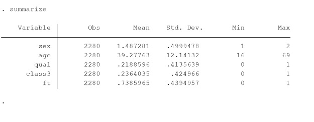
The data used are consistent with the data more comprehensively described in the first blog article which outlined the conventional interaction, and can be found here. The data are from the General Household Survey 1995 teaching dataset (Cooper and Arber 2000) – Table 1. The dependent variable is dichotomous, Register Generals Social Class, controlling for whether an individual is a member of class III or not. Age is included as a linear continuous variable, qualifications is dichotomous, indicating whether an individual has any qualification, or none, sex is a male/female dichotomy, and a final variable controls fulltime or part-time working.

Table 1, distributions of variables of interest

CCW_II_T1An ‘alternative’ parameterisation of a categorical by categorical interaction

An alternative way to specify this interaction is to generate a model that defines all possible categories of the combination of the categorical variables included in the interaction. I describe this here as an ‘alternative specification’ of the interaction. Examples of this specification were provided in Additional table 2 of the first post, as a means to check comparisons between categories.

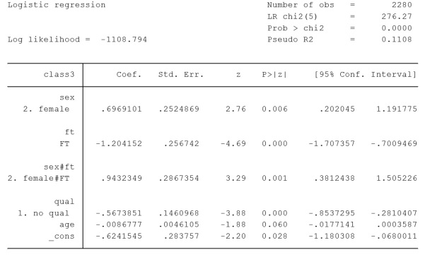
Table 2 displays the alternatively specified interaction. In this instance the model was produced in Stata 13 by placing just one hashtag between the variables to be interacted (i.sex#i.ft). It is also possible to create a composite variable of sex and ft, which is equivalent to this and to include this in the model as a factor variable, or as dummy categories.

The model in Table 2 is statistically identical to the model reported as the conventional interaction (Additional Table 1). For example, log likelihoods and pseudo R2 are exactly the same. The coefficients, and other estimated statistics, for the explanatory variables age and qualification, are also identical between the models. How the interaction term is reported in the model is different, however.

logit class3 i.sex#i.ft i.qual c.age

Table2, Stata output, logistic regression modelling membership of social class III, including independent variables sex, has a qualification, working full-time or part-time and age, also an alternatively reported interaction between sex and working FT/PT. Source is GHS 1995, teaching dataset

CCW_II_T2

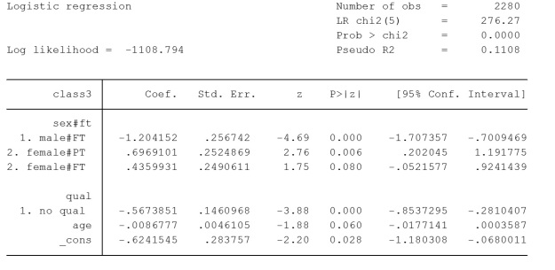
The alternative specification of the interaction variable, in Table2, shows the estimates associated with combinations of categories of sex and working full-time/part-time. There is a reference category and, again, in this instance, it is men working part time. It is often desirable to alter the reference category to check or describe contrasts of interest. In analysis you may choose the reference category depending on numbers of cases in the category. Sometimes there may be a gradient of increasing estimates which tells a story and is neat to show. Alternatively, you may choose the reference category because the contrasts are important to answer a research question.

Here the male/part-time category is the reference category and is contrasted male/FT, female/PT and female/FT. In the model it can be seen that the coefficients for male/working full-time and female/working part time are the same as the coefficients, reported in the conventional interaction (Additional Table 1), for the coefficient values for sex and ft. The interaction in Table 2 also contains a category of females/working full-time which is non-significant, in contrast to the reference category.

The interaction as specified in Additional Table 1 is conventional in the sense that it is specified in a manner in which interactions in OLS models are generally specified. I find the alternative specification, in Table 2, preferable in helping to think through what a categorical by categorical interaction is showing. This parameterisation is not discussed by Kohler and Kreuter (2009) and Royston and Sauerbrei (2012) do not recommend this. In my view the alternative specification provides more clear information. In this specification it is immediately apparent what the reference category is and what the contrasts represent.

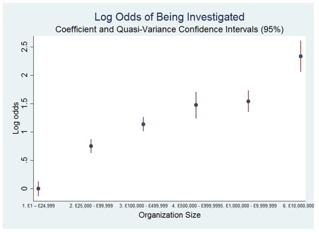
It is also useful to switch the reference category used and/or to estimate quasi-variances (see Connelly 2016) to check substantive associations. If you do this and take time to think through the results, then you are likely to build a strong understanding of the associations the model is representing. You are also likely to catch mistakes.

Conclusions                                                                                                                                                         

This post outlines an ‘alternative specification’ for including categorical by categorical interactions in a logit models. This is contrasted with a conventional specification (from the first post in this series). The alternative specification is shown to have a benefit over the conventional specification in that there is an intuitive interpretation for the levels of the interaction. As part of a sensitivity analysis I currently recommend that a researcher should model a categorical interaction using a range of specifications, including the ‘alternative specification’ outlined here. Being able to see levels of the interacted variables, along with significance, in comparison to the reference, allows an analyst to usefully assess substantive as well as statistical importance. It is also possible to publish a model applying interactions specified in this way (e.g. Ralston et al. 2016; Popham and Boyle 2011).

References

Cooper, H. and Arber, S. 2000. General Household Survey, 1995: Teaching Dataset. [data collection]. 2nd Edition.

Kohler, U. and Kreuter, F. 2009. Data Analysis Using Stata: Second Edition. College Station, Tx: Stata Press.

Popham, F. and Boyle, P.J. 2011. Is there a ‘Scottish effect’ for mortality? Prospective observational study of census linkage studies. Journal of Public Health 33(3), pp. 453–458.

Ralston, K. et al. 2016. Do young people not in education, employment or training experience long-term occupational scarring? A longitudinal analysis over 20 years of follow-up. Contemporary Social Science, pp. 1–18.

Royston, P. and Sauerbrei, W. 2012. Handling Interactions in Stata, especially with continuous predictors. . Available at: http://www.stata.com/meeting/germany12/abstracts/desug12_royston.pdf.

Additional Table 1, Stata output, logistic regression modelling membership of social class III, including independent variables sex, has a qualification, working full-time or part-time and age, also an interaction between age and working FT/PT. Source is GHS 1995, teaching dataset

CCW_II_additional_table

The Determinants of Charity Misconduct

Diarmuid McDonnell & Alasdair Rutherford, 2017

As Corrado “Junior” Soprano, plagiarising a Chinese curse of dubious provenance, puts it: may you live in interesting times. Charities in the UK have been the subject of intense media, political and public scrutiny in recent years, resulting in three parliamentary inquiries. Public confidence and trust in the sector has been questioned in light of various “scandals” including unethical fundraising practices (resulting in the establishment of a new fundraising regulator for England and Wales in 2016), high levels of chief executive pay, politically-motivated lobbying and advocacy work, and poor financial management. Using novel data supplied by the Office of the Scottish Charity Regulator (OSCR), my colleague Dr Alasdair Rutherford and I describe the nature and extent of alleged and actual misconduct by Scottish charities, and ask what organizational and financial factors are associated with this outcome?

Background

First, some background on what we mean when we say “charity”. The Scottish Charity Register is maintained by OSCR which was established in 2003 as an Executive Agency and took up its full powers when the Charities and Trustee Investment (Scotland) Act 2005 came into force in April 2006. In Scotland, a charity is defined (under statute) as an organization that is listed on the Register after demonstrating that it passes the charity test: it must have only charitable purposes; the organization must or intend to provide some form of public benefit; it must not allow its assets to be used for non-charitable purposes; it cannot be governed or directed by government ministers; and it cannot be a political party. One of OSCR’s main responsibilities is to identify and investigate apparent misconduct and protect charity assets. It operationalises this duty by opening an investigation (what they term an inquiry) into the actions of a charity suspected of misconduct and other misdemeanours.

Investigations are mainly initiated as a result of a public complaint but they can also be opened by a referral from a department in OSCR or another regulator. For example, one of the founders of the charity The Kiltwalk reported the organization to OSCR on the grounds that he has concerns over the amount of funds raised by the organization that are spent on meeting the needs of beneficiaries. OSCR can only deal with concerns that relate to charity law – such as damage to charitable assets or beneficiaries, misconduct or misrepresentation – though it can refer cases to other bodies such as when criminal activity is suspected. Finally, the outcome is recorded for each investigation. Outcomes are varied and often specific to each investigation but most can be related to three common categories: no action taken or necessary; advice given; and regulatory intervention.

Method

This study examines two dimensions of charity misconduct that deserve greater attention: regulatory investigation and subsequent action. Regulatory action can take the following two, broad forms: the provision of advice (e.g. recommending a charity improve its financial controls to counteract the threat of fraud or misappropriation) and the use of OSCR’s formal regulatory powers (e.g. reporting the charity to prosecutors or suspending trustees). This study overcomes many of the limitations outlined previously by utilising a novel administrative dataset, derived from OSCR, covering the complete population (current and historical) of registered Scottish charities. It is constructed from three sources: the Scottish Charity Register, which is the official, public record of all charities that have operated in Scotland; annual returns, which are used to populate many of the fields on the Register (e.g. annual gross income); and internal OSCR departmental data relating to misconduct investigations. Once linked using each observation’s Scottish Charity Number, this dataset contains 25,611 observations over the period 2006-2014.

The outcome of being investigated by the regulator is measured using a dichotomous variable that has the value 1 if a charity has been investigated and 0 if not. The other two dependent variables are also dichotomous: regulatory action takes the value 1 if a charity has had regulatory action taken against it and 0 if not; and intervention takes the value 1 if a charity is subject to regulatory intervention and 0 if not (i.e. it received advice instead). The dependent variables are modelled using binary logistic regression. We model the probability of investigation using binary logistic regression as a function of organization size, age, institutional form, field of operations and geographical base.  For the sub-sample of organizations that were investigated, we then model the probability of regulatory action, and its different forms, being taken based on the same characteristics plus the source of the complaint made.

Describing Investigations and Regulatory Action

There have been 2,109 regulatory investigations of 1,566 Scottish charities over the study period: this represents six percent of the total number of organizations active during this time. The number of investigations increased steadily during OSCR’s early years and then plateaued at around 400 per year until 2013/14, when the figure declined slightly. The majority of investigations (78 percent) concerned charities that were investigated only once in their history. A little over 30 percent of investigations resulted in regulatory action being taken against a charity: 16 percent received advice and 13 percent experienced intervention by OSCR.

It is a member of the public that is most likely to contact OSCR with a concern about a charity. Internal stakeholders of the charity account for 31 percent of all investigation initiators, though this disregards the strong possibility that many of those recorded as anonymous are involved in the running of the charity they have a concern about. The concerns that prompt these actors to raise a complaint with OSCR are numerous and diverse. Figure 1 below visualizes the associations between the most common types of complaint and the response of the regulator. The overriding concern is general governance, as well as associated issues such as the duties of trustees and adherence to the founding document. Financial misconduct also ranks highly, particularly the misappropriation of funds and suspicion of financial irregularity.

Figure 1. Association between type of complaint and regulator response

Figure1

Note: Each complaint can have two types, and maps to one of the regulatory responses. The fifteen most common complaint types are shown. The thickness of the line is proportional to the number of complaints leading to each regulatory response.

Modelling the Risk of Investigation and Action

In Table 3, we report the odds ratios (exponentiated coefficients) rather than the log odds as they approximate the relative risk of each outcome occurring. This is appropriate not only for ease of interpretation but because the absolute chance of either outcome occurring is low (i.e. it is better to know which charities are more likely relative to their peers). The category with the most observations is chosen as the base category for each nominal independent variable.

Table 1. Results of Logistic Regression on dependent variables

Tabel1

We first examine the effects of organization age and size on the outcomes. The coefficient for age varies across the three outcomes. A one-unit increase in the log of age results in a five percent decrease in the odds of being investigated or being subject to regulatory action; however, the odds of experiencing intervention compared to receiving advice are higher for older charities. There appears to be a clear income gradient present in the investigation model: as organization size increases so do the odds of being investigated compared to the reference category. With regards to the actor that initiates an investigation, it appears that stakeholders with a monitoring role (e.g. funders, auditors or other regulators) are more likely than members of the public to report concerns that warrant some form of regulatory action; in contrast, internal charity stakeholders such as employees and volunteers have higher odds of identifying concerns that merit the provision of advice by OSCR and lower odds of triggering regulatory intervention in their charity.  While size predicts complaints, it is the source of the complaint that is a more reliable predictor of the need for regulators to take action.

A more nuanced examination of the effect of organization size is possible by comparing categories of this variable to each other and not just the base category (shown in Figure 2). Drawing on suggestions by Firth (2003), Firth and Menezes (2004), and Gayle and Lambert (2007), we employ quasi-variance standard errors to ascertain whether categories of organization size are significantly different from each other. Unsurprisingly, the largest charities have significantly higher odds than all other categories; however it appears that the middle categories (charities with income between £100,000 and £1m) are not significantly different from each other and neither are organizations between £500,000 and £10m.

Figure 2. Quasi-Variance log odds of being investigated

Figure2

Conclusion

The results of the multivariate analysis point to the factors associated with charity investigation and misconduct, showing the mismatch between those predicting complaints and those predicting regulatory action. This has considerable implications for charity regulators seeking to deploy their limited resources effectively and in a way that ultimately protects and enhances public confidence. By revealing the disconnect between the level of complaints and concerns that require regulatory action, we argue there is much work to do for practitioners in the sector with regards to charity reputation and stakeholder communication. Charity boards are ultimately responsible for the governance of their organization, and must ensure that adequate policies and procedures are in place. This includes reducing the risk of misconduct occurring, taking corrective action in response to guidance from the regulator, and developing the management and reporting functions required to deal with the consequences. Recognition should also be given to the role that stakeholders such as funders and auditors must play in self-regulation of the sector, given their proximity to charities through their day-to-day activities. It is no longer sufficient (if indeed it ever was) to rely on charity status to convey trust and inspire confidence in the conduct of an organization.

Mugged by reality

‘Danny’ Blanchflower on Brexit and Trump: a report of a public lecture, University of Stirling, 8th December, 2016

Kevin Ralston, University of Edinburgh, 2016

danny_blanchflower

(Danny Blanchflower on Bloomberg TV)

‘It’s the labour market stupid’ was a refrain in a lecture given by professor Blanchflower on Brexit and other surprises. It’s the labour market stupid is also the title of his next book.

David ‘Danny’ Blanchflower is an academic and economist whose work carries well beyond the Ivy League university in which he has a chair endowed. He sat on the Bank of England’s Monetary Policy Committee across the period of the financial crash 2006 to 2008 and is currently a visiting scholar at the Federal Reserve in Boston. In the UK he regularly writes for the Guardian and works for the U.S. based financial news broadcaster, Bloomberg, indeed he was live on TV as the UK voted for Brexit. His opposition to Brexit led Michael Gove to tweet him during the course of the campaign to accuse him of being ‘mugged by reality’. In this crossover to the mainstream Blanchflower is one of those larger than life academics, whose personality combines with an intellectual capacity that has given his views a platform, that many aspire to, but few reach.

As well as being a Professor of Economics at Dartmouth, he is a part-time professor at the University of Stirling. This connection is what brings someone who is, by any standards, an academic heavyweight, to a relatively obscure corner of Scotland, to give a public lecture on a cold, dark, December evening.

Danny’s thesis is that the Brexit vote, and the support for Trump, is explicable by many in the economy having been left behind, especially following the Great Recession of 2008. He cites evidence drawn from several sources throughout the talk.

The argument is compelling. Nine million of the working aged population are indicated to have disappeared from U.S. labour force statistics. Following the economic collapse, underemployment has become a particular feature of the UK economy, with data showing part-time workers, and the self-employed, craving more hours.

This is contrary to the Governments of U.S. and UK and their absurdly jaundiced insistence that we are basking in some version of full employment. A political strapline cannot deny the lived experience of people on welfare, regardless of how quickly life went back to normal for the elites following the 2007/08 crash.

A fundamental rule of economics is that rising employment drives up wages. A simple supply and demand system. Blanchflower shows wages are stagnating. In the UK wages are 7% down from their peak, in the USA real wages are below what they were in 1973 for the typical worker. No wage growth means there is no full employment. This is regardless of how the figures are massaged, and the bad news disregarded, to maintain a political mantra that the economy is performing well.

Special disdain is reserved for government economists and politicians who are considered to have lost all economic credibility. Apart from their denial of the realities of the labour market, this group are guilty of what the Danny describes as ‘fingers crossed economics’. This is characterised by the insistence on projecting forecasts that bear no association with reality. A central part of this is repeated assertions, over years, that interest rates will rise along with wages. Blanchflower shows official wage projections predicting four percent plus wage rises across years when growth was, at best, two percent. In addition the markets have been repeatedly told interest rates will rise in stages over time, but they have necessarily remained close to zero. The result of repeatedly promising one thing but delivering another is that that no one believes these forecasts anymore. Whatever credibility the establishment economists and politicians ever had has ebbed away in the decade following the crash.

The upshot of all of this is that many have been left behind by the economic collapse, out of work, underemployed and worse off than they were before the downturn. Those who have been left behind are far more likely to have voted for Brexit or Trump. Some of the figures are startling. Lower wages explains forty-six percent of the variance in accounting for a vote for Trump, male obesity explains seventeen percent. In the U.S. the older, white, less educated and poor, were more likely to back Trump. The unemployment rate amongst men aged 25-54 with no college education is 20% in the U.S.A. If you are one of these people what choice do have? If the elites practice ‘fingers crossed economics’, can we blame these people if they engage in fingers crossed politics?

The parting shot is that confidence in the UK has collapsed. All regions now report the outlook as dramatically worse than they did a few months ago. Responses to a survey question on whether the economic prospects for the next ten years have gotten better or worse illustrates the stark decline. In July 2016, before the referendum, the South East (of England) was responding positively to a ten year forecast at +8, by August this has haemorrhaged to -30. In Scotland the pessimism knows no bounds, with a gloomy -28 in July nosediving to a despair inducing -42.

Things could not get much worse! Except they could and Danny is not sure that we can expect our elite leaders to do the right things to get us out of this. He points out, the OECD suggests the UK to be one of the best placed countries to introduce fiscal stimulus, funding investments with deficits to offset the massive loss of wealth we have just gone through, but the Chancellor refuses to act.

Maybe, just maybe, Blanchflower muses, to a question from the audience, Trump will issue a 30 trillion dollar bond and build, educate and invest the U.S.A. out of the decade long semi-slump that has followed the recession, maybe. Unfortunately it is hard to leave this lecture without feeling we have all been mugged by reality and the consequences of this are only just beginning to be felt.

All maps are inaccurate but some have very useful applications: Thoughts on Complex Social Surveys

Vernon Gayle, University of Edinburgh

rudi_cafe-copy

This blog post provides some thoughts on analysing data from complex social surveys, but I will begin with an extended analogy about maps.

All maps are inaccurate. Orienteering is a sport that requires navigational skills to move (usually running) from point to point in diverse and often unfamiliar terrain. It would be ridiculous to attempt to compete in an orienteering event using a road map drawn on a scale of 1:250,000, this is because 1 cm of the map represents 2.5 kilometres. Similarly it would be inappropriate to drive from Edinburgh to London using orienteering maps which are commonly drawn on a scale of 1:15,000. On an orienteering map 1 cm represents 150 metres of land.

Hillwalking is a popular pastime in Scotland. Despite having similar aims many hillwalkers use the standard Ordnance Survey (OS) 1:50,000 map (the Landranger Series) but others prefer the 1:25,000 OS map. These maps are not completely accurate but they have useful applications for the hillwalker. For some hillwalking excursions the extra detail offered by the 1:25,000 map is useful. For other journeys the extra detail is superfluous and having coverage of a larger geographical area is more useful. When possible I prefer to use the Harvey’s 1:25,000 Superwalker maps. This is because they are printed on waterproof paper and they tend to cover whole geographic areas so walks are usually contained on a single map. I also find the colour scheme helpful in distinguishing features (especially forests and farmland), and the enlargements (for example the 1:12,500 chart of the Aonagh Egach Ridge on the reverse of the Glen Coe map) aid navigation in difficult terrain.

The London Underground (or Tube) map is probably one of the best known schematic maps. It was designed by Harry Beck in 1931. Beck realised that because the network ran underground, the physical locations of the stations were largely irrelevant to a passenger who simply wanted to know how to get from one station to another. Therefore only the topology of the train route mattered. It would be unusual to use the Tube map as a general navigational aid but it has useful applications for travel on the London Underground.

The Tube map has undergone various evolutions, however the 1931 edition would still be an adequate guide for a journey on the Piccadilly Line from Turnpike Lane to Earls Court. By contrast a journey from Turnpike Lane station to Southwark station using the 1931 map will prove confusing since the map does not include the Jubilee Line, and Southwark station was not opened until the 1990s. A traveller using the 1931 map will not be aware that Strand station on the Northern Line was closed in the early 1970s.

Contemporary versions of the Tube map include the fare zones, which is a useful addition for journey planning. More recently editions include the Docklands Light Railway and Overground trains which extend the applications of the Tube map for journeys in the capital.

Here are two further thoughts on the accuracy of the tube map and its applications. First, when I was a schoolboy growing up in London I was amused that what appeared to me the shortest journey on the Tube map from Euston Square station to Warren Street station involved three stops and one change. I knew that in reality the stations were only less than 400 metres apart (my father was a London Taxi driver). Walking rather than taking the Tube would save both time and money.

Second, more recently I have become aware of the journey from Finchley Road tube station to Hampstead tube station which involves travelling on the Jubilee Line and making changes onto the Victoria Line and then the Northern Line. The estimated journey on the Transport for London website is about 30 minutes. Consulting a London street map reveals that the stations are less than a mile apart. A moderately fit traveller could easily walk that distance in less than half an hour. The street map (like the Tube map) is unlikely to warn the traveller that the journey is up hill however. Finchley Road underground station is 217 feet above sea level and Hampstead station is 346 feet above sea level (see here).

This preamble hopefully reinforces my opening point that all maps are inaccurate, but sometimes they have very useful applications. Some readers will know the statement made by the statistician George Box that all models are wrong but some are useful. This statement is especially helpful in reminding us that models are representations of the social world and not accurate depictions of the social world. Similarly a map is not the territory. When thinking about samples of social science data I find the analogy with maps useful as a heuristic device.

All samples of social science data are inaccurate, especially those that are either small or have been selected unsystematically. Some samples are both small and unsystematically selected. Small sample and unsystematic samples may prove useful in some circumstances but their design places limitations on how accurately the data represents the population being studied. Large-scale samples that are selected systematically will tend to be more accurate and better represent target populations. The usefulness of any sample of social science data, much like a map, will depend on its use (e.g. the research question that is being addressed).

Some large-scale social surveys use simple statistical techniques to select participants. The data within these surveys can be analysed relatively straightforwardly. Many more contemporary large-scale social surveys have complex designs and use more sophisticated statistical techniques to select participants. The motivation is usually to better represent the target population, to minimise the costs of data collection, and to allow meaningful analyses of subpopulations (or smaller groups).These are positive features but they come at the cost of making the data from complex surveys more difficult to analyse.

It is possible to approach the analysis of data from complex social surveys naively and treat them as if they were produced by a simple design and selection strategy. For some analyses this will be an adequate approach. This is analogous to using a suboptimal map but still being able to arrive close enough to your desired destination.

For other studies a naïve approach to analysis will be inappropriate. Comparing naïve results with results from more sophisticated analysis can help us to assess the appropriateness of naïve approaches. The difficulty is that reliable statements cannot easily be made a priori on the appropriateness of naïve approaches. To draw further on the map analogy, when using an inadequate map it is difficult to assess how close you get to the correct destination unless you have previously visited that location.

The benefit of social surveys with complex designs is that they have complex designs. The drawback of social surveys with complex designs is that they have complex designs. All maps are inaccurate but some have very useful applications. All samples of social science data are inaccurate but some have very useful applications. The consideration of the usefulness of a set of social science data requires serious methodological thought and this will most probably be best supported by exploratory investigations and sensitivity analyses.

To learn more about analysing data from both non-complex and complex social surveys come to grad school at the University of Edinburgh (http://www.sps.ed.ac.uk/gradschool).