Monthly Archives: December 2016

Mugged by reality

‘Danny’ Blanchflower on Brexit and Trump: a report of a public lecture, University of Stirling, 8th December, 2016

Kevin Ralston, University of Edinburgh, 2016

danny_blanchflower

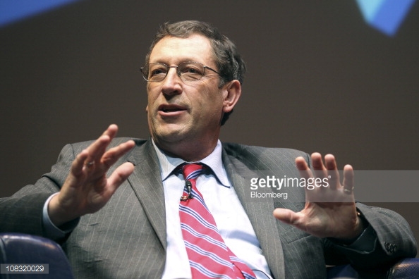
(Danny Blanchflower on Bloomberg TV)

‘It’s the labour market stupid’ was a refrain in a lecture given by professor Blanchflower on Brexit and other surprises. It’s the labour market stupid is also the title of his next book.

David ‘Danny’ Blanchflower is an academic and economist whose work carries well beyond the Ivy League university in which he has a chair endowed. He sat on the Bank of England’s Monetary Policy Committee across the period of the financial crash 2006 to 2008 and is currently a visiting scholar at the Federal Reserve in Boston. In the UK he regularly writes for the Guardian and works for the U.S. based financial news broadcaster, Bloomberg, indeed he was live on TV as the UK voted for Brexit. His opposition to Brexit led Michael Gove to tweet him during the course of the campaign to accuse him of being ‘mugged by reality’. In this crossover to the mainstream Blanchflower is one of those larger than life academics, whose personality combines with an intellectual capacity that has given his views a platform, that many aspire to, but few reach.

As well as being a Professor of Economics at Dartmouth, he is a part-time professor at the University of Stirling. This connection is what brings someone who is, by any standards, an academic heavyweight, to a relatively obscure corner of Scotland, to give a public lecture on a cold, dark, December evening.

Danny’s thesis is that the Brexit vote, and the support for Trump, is explicable by many in the economy having been left behind, especially following the Great Recession of 2008. He cites evidence drawn from several sources throughout the talk.

The argument is compelling. Nine million of the working aged population are indicated to have disappeared from U.S. labour force statistics. Following the economic collapse, underemployment has become a particular feature of the UK economy, with data showing part-time workers, and the self-employed, craving more hours.

This is contrary to the Governments of U.S. and UK and their absurdly jaundiced insistence that we are basking in some version of full employment. A political strapline cannot deny the lived experience of people on welfare, regardless of how quickly life went back to normal for the elites following the 2007/08 crash.

A fundamental rule of economics is that rising employment drives up wages. A simple supply and demand system. Blanchflower shows wages are stagnating. In the UK wages are 7% down from their peak, in the USA real wages are below what they were in 1973 for the typical worker. No wage growth means there is no full employment. This is regardless of how the figures are massaged, and the bad news disregarded, to maintain a political mantra that the economy is performing well.

Special disdain is reserved for government economists and politicians who are considered to have lost all economic credibility. Apart from their denial of the realities of the labour market, this group are guilty of what the Danny describes as ‘fingers crossed economics’. This is characterised by the insistence on projecting forecasts that bear no association with reality. A central part of this is repeated assertions, over years, that interest rates will rise along with wages. Blanchflower shows official wage projections predicting four percent plus wage rises across years when growth was, at best, two percent. In addition the markets have been repeatedly told interest rates will rise in stages over time, but they have necessarily remained close to zero. The result of repeatedly promising one thing but delivering another is that that no one believes these forecasts anymore. Whatever credibility the establishment economists and politicians ever had has ebbed away in the decade following the crash.

The upshot of all of this is that many have been left behind by the economic collapse, out of work, underemployed and worse off than they were before the downturn. Those who have been left behind are far more likely to have voted for Brexit or Trump. Some of the figures are startling. Lower wages explains forty-six percent of the variance in accounting for a vote for Trump, male obesity explains seventeen percent. In the U.S. the older, white, less educated and poor, were more likely to back Trump. The unemployment rate amongst men aged 25-54 with no college education is 20% in the U.S.A. If you are one of these people what choice do have? If the elites practice ‘fingers crossed economics’, can we blame these people if they engage in fingers crossed politics?

The parting shot is that confidence in the UK has collapsed. All regions now report the outlook as dramatically worse than they did a few months ago. Responses to a survey question on whether the economic prospects for the next ten years have gotten better or worse illustrates the stark decline. In July 2016, before the referendum, the South East (of England) was responding positively to a ten year forecast at +8, by August this has haemorrhaged to -30. In Scotland the pessimism knows no bounds, with a gloomy -28 in July nosediving to a despair inducing -42.

Things could not get much worse! Except they could and Danny is not sure that we can expect our elite leaders to do the right things to get us out of this. He points out, the OECD suggests the UK to be one of the best placed countries to introduce fiscal stimulus, funding investments with deficits to offset the massive loss of wealth we have just gone through, but the Chancellor refuses to act.

Maybe, just maybe, Blanchflower muses, to a question from the audience, Trump will issue a 30 trillion dollar bond and build, educate and invest the U.S.A. out of the decade long semi-slump that has followed the recession, maybe. Unfortunately it is hard to leave this lecture without feeling we have all been mugged by reality and the consequences of this are only just beginning to be felt.

All maps are inaccurate but some have very useful applications: Thoughts on Complex Social Surveys

Vernon Gayle, University of Edinburgh

rudi_cafe-copy

This blog post provides some thoughts on analysing data from complex social surveys, but I will begin with an extended analogy about maps.

All maps are inaccurate. Orienteering is a sport that requires navigational skills to move (usually running) from point to point in diverse and often unfamiliar terrain. It would be ridiculous to attempt to compete in an orienteering event using a road map drawn on a scale of 1:250,000, this is because 1 cm of the map represents 2.5 kilometres. Similarly it would be inappropriate to drive from Edinburgh to London using orienteering maps which are commonly drawn on a scale of 1:15,000. On an orienteering map 1 cm represents 150 metres of land.

Hillwalking is a popular pastime in Scotland. Despite having similar aims many hillwalkers use the standard Ordnance Survey (OS) 1:50,000 map (the Landranger Series) but others prefer the 1:25,000 OS map. These maps are not completely accurate but they have useful applications for the hillwalker. For some hillwalking excursions the extra detail offered by the 1:25,000 map is useful. For other journeys the extra detail is superfluous and having coverage of a larger geographical area is more useful. When possible I prefer to use the Harvey’s 1:25,000 Superwalker maps. This is because they are printed on waterproof paper and they tend to cover whole geographic areas so walks are usually contained on a single map. I also find the colour scheme helpful in distinguishing features (especially forests and farmland), and the enlargements (for example the 1:12,500 chart of the Aonagh Egach Ridge on the reverse of the Glen Coe map) aid navigation in difficult terrain.

The London Underground (or Tube) map is probably one of the best known schematic maps. It was designed by Harry Beck in 1931. Beck realised that because the network ran underground, the physical locations of the stations were largely irrelevant to a passenger who simply wanted to know how to get from one station to another. Therefore only the topology of the train route mattered. It would be unusual to use the Tube map as a general navigational aid but it has useful applications for travel on the London Underground.

The Tube map has undergone various evolutions, however the 1931 edition would still be an adequate guide for a journey on the Piccadilly Line from Turnpike Lane to Earls Court. By contrast a journey from Turnpike Lane station to Southwark station using the 1931 map will prove confusing since the map does not include the Jubilee Line, and Southwark station was not opened until the 1990s. A traveller using the 1931 map will not be aware that Strand station on the Northern Line was closed in the early 1970s.

Contemporary versions of the Tube map include the fare zones, which is a useful addition for journey planning. More recently editions include the Docklands Light Railway and Overground trains which extend the applications of the Tube map for journeys in the capital.

Here are two further thoughts on the accuracy of the tube map and its applications. First, when I was a schoolboy growing up in London I was amused that what appeared to me the shortest journey on the Tube map from Euston Square station to Warren Street station involved three stops and one change. I knew that in reality the stations were only less than 400 metres apart (my father was a London Taxi driver). Walking rather than taking the Tube would save both time and money.

Second, more recently I have become aware of the journey from Finchley Road tube station to Hampstead tube station which involves travelling on the Jubilee Line and making changes onto the Victoria Line and then the Northern Line. The estimated journey on the Transport for London website is about 30 minutes. Consulting a London street map reveals that the stations are less than a mile apart. A moderately fit traveller could easily walk that distance in less than half an hour. The street map (like the Tube map) is unlikely to warn the traveller that the journey is up hill however. Finchley Road underground station is 217 feet above sea level and Hampstead station is 346 feet above sea level (see here).

This preamble hopefully reinforces my opening point that all maps are inaccurate, but sometimes they have very useful applications. Some readers will know the statement made by the statistician George Box that all models are wrong but some are useful. This statement is especially helpful in reminding us that models are representations of the social world and not accurate depictions of the social world. Similarly a map is not the territory. When thinking about samples of social science data I find the analogy with maps useful as a heuristic device.

All samples of social science data are inaccurate, especially those that are either small or have been selected unsystematically. Some samples are both small and unsystematically selected. Small sample and unsystematic samples may prove useful in some circumstances but their design places limitations on how accurately the data represents the population being studied. Large-scale samples that are selected systematically will tend to be more accurate and better represent target populations. The usefulness of any sample of social science data, much like a map, will depend on its use (e.g. the research question that is being addressed).

Some large-scale social surveys use simple statistical techniques to select participants. The data within these surveys can be analysed relatively straightforwardly. Many more contemporary large-scale social surveys have complex designs and use more sophisticated statistical techniques to select participants. The motivation is usually to better represent the target population, to minimise the costs of data collection, and to allow meaningful analyses of subpopulations (or smaller groups).These are positive features but they come at the cost of making the data from complex surveys more difficult to analyse.

It is possible to approach the analysis of data from complex social surveys naively and treat them as if they were produced by a simple design and selection strategy. For some analyses this will be an adequate approach. This is analogous to using a suboptimal map but still being able to arrive close enough to your desired destination.

For other studies a naïve approach to analysis will be inappropriate. Comparing naïve results with results from more sophisticated analysis can help us to assess the appropriateness of naïve approaches. The difficulty is that reliable statements cannot easily be made a priori on the appropriateness of naïve approaches. To draw further on the map analogy, when using an inadequate map it is difficult to assess how close you get to the correct destination unless you have previously visited that location.

The benefit of social surveys with complex designs is that they have complex designs. The drawback of social surveys with complex designs is that they have complex designs. All maps are inaccurate but some have very useful applications. All samples of social science data are inaccurate but some have very useful applications. The consideration of the usefulness of a set of social science data requires serious methodological thought and this will most probably be best supported by exploratory investigations and sensitivity analyses.

To learn more about analysing data from both non-complex and complex social surveys come to grad school at the University of Edinburgh (http://www.sps.ed.ac.uk/gradschool).